Botany

Botany Farms was no stranger to beverages, but the rapidly growing THC drink market demanded something bigger. We helped Botany launch a flagship beverage designed to disrupt the category—leveraging years of brand equity while creating an entirely new expression built to command attention on shelf.

Category

THC Beverage

Scope

Packaging, Illustration, Art Direction, Creative Direction

Packaging, Illustration, Art Direction, Creative Direction

Challenge

Launching a Distinctive THC Beverage Fast in a Saturated Market

Launching a Distinctive THC Beverage Fast in a Saturated Market

Botany Hero Can

problem

THC beverages were exploding across the country, bringing an influx of new brands into a rapidly changing category. Botany needed more than another drink—it needed a flagship product capable of competing on shelf while feeling unmistakably connected to the brand consumers already knew. The challenge was to leverage Botany’s existing recognition while creating something unexpected enough to stand apart in a crowded beverage aisle.

Botany Can
Botany Cooler

solution

Consumers already knew Botany Farms simply as “Botany,” so we made that equity impossible to miss. Oversized typography turned the name into the can’s defining visual, balanced by delicate custom illustrations inspired by each flavor and familiar brand details that kept the system distinctly Botany. Set against raw aluminum, the contrast created a striking, unconventional presence that felt both familiar and entirely new—giving Botany a flagship beverage built to command attention in a crowded category.

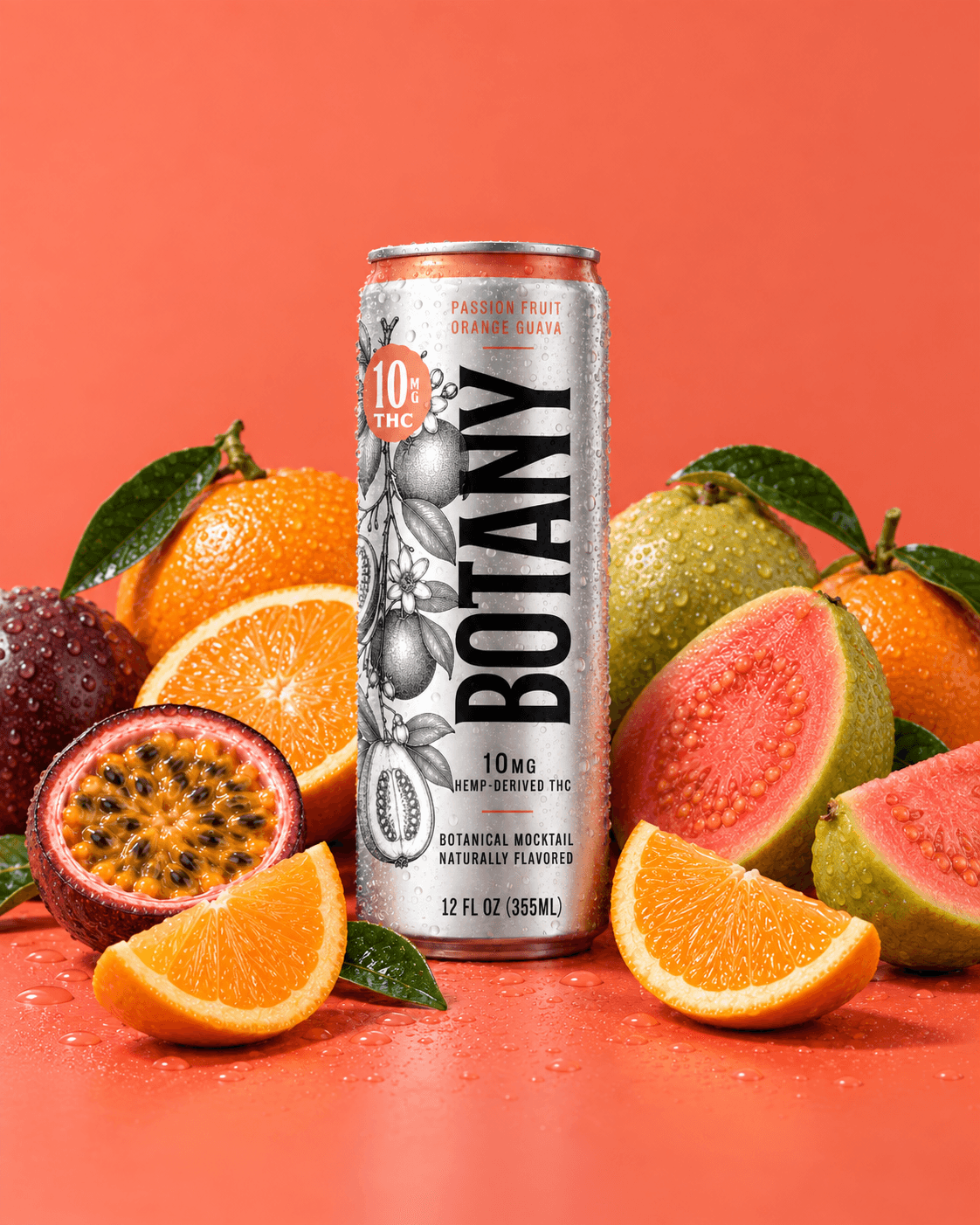
Botany THC Botanical Beverage
Botany THC POG
Botany POG Box
Botany POG Can
Botany Blueberry Can
Botany Bueberry Can
Botany Blueberry Box
Botany Can Family
Botany Can Family
Botany Can back
Botany Can back
Botany Gravity Can
Botany THC Box Closeup

Owning Botany

Botany already had recognition. The opportunity was to use it more aggressively. By reducing the front of the can to the name customers already knew, we turned existing brand equity into the strongest visual asset on shelf. The result is immediate, unmistakable, and flexible enough to carry across flavors without losing recognition.

Botany Logo
Botany Box Lineup

Built Beyond the Can

The system was designed to extend beyond the can from the start. Flavor illustrations, typography, color, and supporting brand elements created a flexible visual language that could carry into multipacks, retail materials, digital campaigns, social content, and future product extensions without losing the clarity of the core identity.

More Case Studies.

Ready for what’s next?

If your business has outgrown its brand, let’s build one that reflects where you are—and where you’re going.

TRUSHIN

Studio Thinks

Thoughts on building better brands.

TRUSHIN

Studio Thinks

Thoughts on building better brands.

TRUSHIN

Studio Thinks

Thoughts on building better brands.