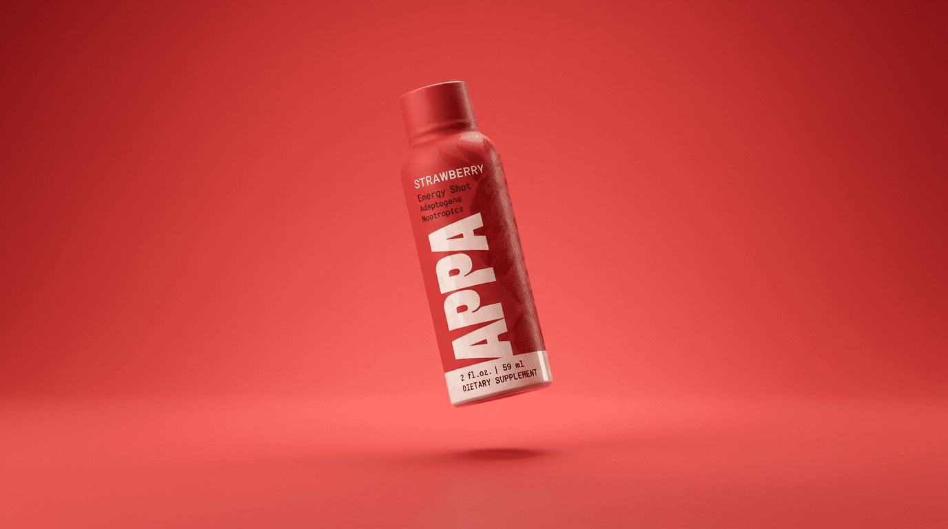
Appa
APPA began as a functional mushroom beverage and gummy brand built for the wellness space. As the business matured, a new retail opportunity required a significant shift—repositioning the beverage for the convenience channel while preserving its product chemistry and natural foundation.
Category
Functional Energy / Wellness Beverage
Scope
Challenge

problem
The challenge was bigger than changing packaging. APPA needed to move from a wellness-led identity into a faster, more accessible energy-shot category without becoming generic, overly aggressive, or falling into the familiar “woo-woo” language of natural wellness. The product still needed to communicate functional ingredients and natural benefits in a way that felt immediate and easy to understand for a much broader audience. In the convenience channel, where decisions happen quickly and products compete for attention at a glance, the packaging needed to become more minimal, more legible, and far more impactful on shelf. Complicating the shift was a fixed market-testing window, which meant the strategy, identity, packaging, and launch system all had to be rebuilt quickly and with very little room for delay.


solution
Trushin Studio repositioned APPA around a clearer, more mainstream energy proposition while preserving enough of its wellness DNA to remain differentiated. The new system became bolder, brighter, and more minimal—using larger typography, stronger color, and a simplified hierarchy to create instant readability and fast shelf recognition in a crowded convenience environment.
The logo, packaging, and broader visual language were rebuilt to communicate natural qualities without overwhelming the consumer. Working backward from a fixed launch deadline, we delivered the new system in time for market testing across two initial flavors. The launch tested positively, leading APPA to expand the line with two additional SKUs positioned as caffeine alternatives.